Glow Digital
Transforming digital chaos into a radiant, scalable brand system that empowers creators to earn more while working less.
Role
Brand Designer & Lead Strategist
Timeline
6 weeks, August 2025 - September 2025
Industry
Coaching & Business Systems
Deliverables
Brand Strategy, Visual Identity System, Logo Architecture, Full Branding Guidelines

Quick Overview
Glow Digital, founded by Flo, is a strategic partner for online entrepreneurs scaling beyond six figures. While Flo’s "G.L.O.W. System" provided elite-level business transformation, her visual brand was stuck in a "manual" phase—lacking the premium resonance and structural clarity her high-ticket offers ($3K–$8K) demanded. I was brought in to translate her mission of "Flow over Force" into a cohesive visual language that merges strategy with soul.

Problem
The Gap Between Performance and Perception. The founder was providing high-level strategy, but the brand touchpoints felt inconsistent and "tech-heavy" rather than "results-heavy."
Business Challenge: Attracting high-ticket clients requires a brand that radiates authority and "calm scaling."
User Pain Points: Prospective clients felt overwhelmed by the "tech" side of growth; the existing brand didn't offer the visual "relief" or clarity they were seeking.
Market Context: The coaching industry is saturated with "hustle-core" aesthetics; Glow Digital needed to stand out through "sustainable growth" and "illumination."
Goal / Objective
Product Goal: Build a "Brand Clarity" framework that supports a 90-day growth program (The G.L.O.W. System).
UX Goal: Create a visual rhythm that guides a user from "Overwhelm" (Chaos) to "Clarity" (Glow).
Success Metrics: A 100% cohesive visual ecosystem across LinkedIn, Canva, and Framer, reducing "tech-stress" for the founder and increasing perceived value.

Research & Discovery
Strategy-First Design. Through deep-dive strategy interviews based on the Brand Clarity Statement, we identified that the core value wasn't "automation"—it was freedom.
Audience Audit: We targeted "The Overwhelmed Visionary"—the entrepreneur doing everything manually who needs a "Growth Partner," not just a freelancer.
Key Insight: The brand needed to feel like a "lighthouse"—a source of clarity in a noisy digital market. We moved away from "cold tech" blues and toward "illuminated" warmth.
Strategy
The "Radiant Structure" Framework. My strategy was to bridge the gap between Emotional Resonance (how scaling feels) and Logical Structure (how systems work).
Positioning: "Shine brighter. Scale smarter."
UX Direction: Using "Flow" as a design principle—ensuring every visual element felt natural and evolving, not forced or rigid.
Information Architecture: Organizing the brand assets into a "System Build" logic, mirroring the G.L.O.W. 90-day program.
Design Process
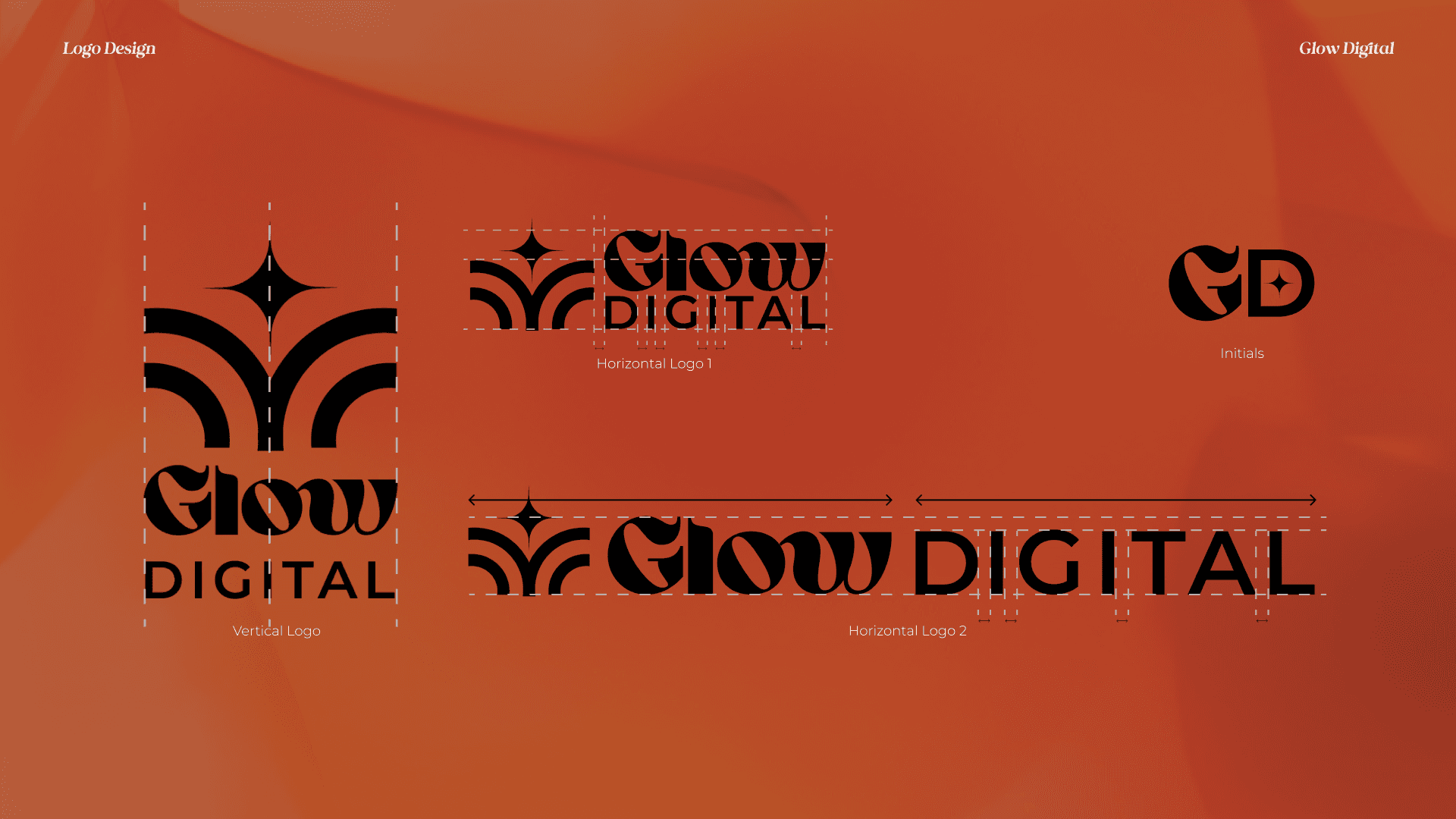
Logo Architecture: Developed a symbol featuring four organic beams forming leaf-like shapes (Natural Evolution) centered by a star (Clarity/Transformation).
Visual Rhythm: We moved from "static" icons to a custom iconography system (Sun, Star, Arrow) representing the journey of growth.
Typography Selection:
Bigola Display: For high-ticket elegance and "Next Level" authority.
Montserrat: For functional clarity and "sustainable" readability.


Solution
A Radiant, Trustworthy Identity. The final solution was a "Brand Guidelines" system that allows the founder to scale her own content without "tech-friction."
Color Palette: Caramel Orange (Energy) and Marrakesh Brown (Groundedness) balanced by Royal Blue (Authority).
System Assets: Created a library of Canva and LinkedIn templates that allow for "Recurring Growth" in marketing efforts.
The Result: A brand that doesn't just sell "tech setup," but sells the "Freedom to Glow."

Outcome / Impact
From Solo to Supported: The brand now positions Flo as a "Growth Partner," justifying the $3K–$8K price point of the G.L.O.W. System.
Visual Cohesion: 100% alignment between the founder’s vision of "scaling without burnout" and the visual experience of the brand.
Recruiter's Perspective: This project demonstrates the ability to translate complex business values (Sustainable Growth) into a functional design system that drives ROI.
Designing for Alignment. This project reinforced that in UX/UI, the "User" isn't just the customer—it's the founder who has to live in the brand every day. By building a system that feels "natural" and "aligned," we created a business structure that scaling feels inspiring rather than exhausting.
Next project

trundl